Nick Karagiannis on the Kodak Portra – The Gold Standard for Natural Colours
Nick Karagiannis has tested nearly every film stock still in production. From the deep shadows of Ilford Delta to the punchy palettes of Ektar, his toolkit spans both extremes of tone and contrast. But when asked which film he returns to time and again, for portraits, landscapes, and everything in between, the answer comes easily: Kodak Portra.
“I’ve called it my anchor film,” Nick says. “Because no matter how far I push creatively, I know Portra will always render the world with honesty and grace.”
In a photography scene saturated with digital clarity and bold filters, Kodak Portra remains a quiet revolution, capturing natural colour with subtlety, warmth, and fidelity. It’s Nick’s go-to in Sydney’s harsh light, Australia’s rich terrains, and in any moment where emotion matters more than punch.
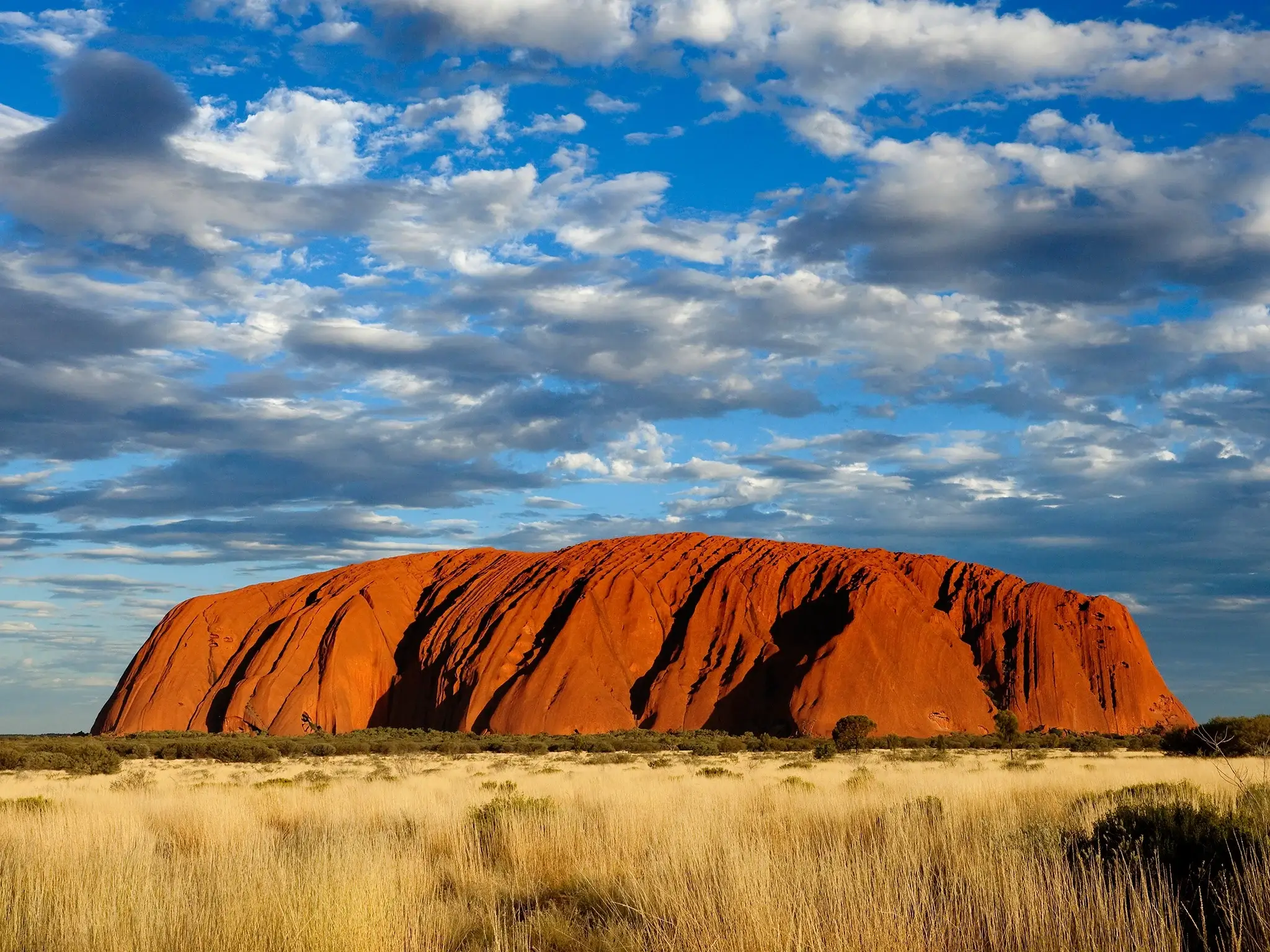
 Photo by philm1310 on Pixabay
What Is Kodak Portra?
Kodak Portra is a professional-grade colour negative film designed for portraiture and skin tones. Available in ISO 160, 400, and 800, it’s known for its smooth grain structure, wide exposure latitude, and soft, natural colour palette.
For Nick, it’s not just a film, it’s a philosophy.
“Kodak Portra doesn’t exaggerate,” he explains. “It listens. It interprets. It gives back the colour of the world without screaming.”
He often recommends it to photographers exploring Australia’s diverse lighting conditions, from the cool mornings in the Blue Mountains to the golden haze along Sydney’s coastal cliffs. Few films respond as flexibly or as beautifully to natural light.
Kodak Portra’s Strength: Colour That Breathes
Nick Karagiannis’s favourite thing about Kodak Portra is how it handles colour. Rather than oversaturating skies or flattening skin tones, it lets colours breathe, delivering a realism that feels like memory.
Portrait Perfection
When shooting people, Nick finds that Kodak Portra 400 renders skin in a way that feels luminous, not artificial. “It handles warmth without turning orange, and shadows without turning grey,” he says. This is particularly useful under Australia’s often unforgiving sun.
He’s used it for everything from candid street portraits in Sydney’s Newtown to delicate environmental shots on the Glebe foreshore. Even when scanned digitally, Portra retains a painterly softness that stands apart from most colour films.
Natural Landscapes
As part of his Australian nature photography work, Nick uses Kodak Portra to photograph coastal scenes, native bushland, and rolling rural hills. He favours the 160 version in strong daylight, praising its subtle greens, warm skies, and ability to retain highlights in bright scenes.
“Where other films would blow out the clouds or exaggerate the greens, Portra lets you see the moment as it was, gentle, textured, alive,” he says.
Comparing the Kodak Portra Trio: 160, 400, and 800
 Photo by Hongwei FAN on Unsplash
Each Portra variant has a distinct character. Nick Karagiannis uses all three, depending on location, light, and subject.
Kodak Portra 160
- Best for: Studio shoots, portraits, bright daylight
- Look: Softest colour palette, least grain, incredible detail
- Nick’s Use: Botanical close-ups, controlled portrait sessions, early afternoon beach scenes
Kodak Portra 400
- Best for: All-purpose photography , especially outdoors
- Look: Balanced contrast, moderate grain, beautiful skin tones
- Nick’s Use: Street photography, documentary work, light-changing conditions
- “It’s my daily driver,” he says. “It adapts without effort.”
Kodak Portra 800
- Best for: Low light, golden hour, handheld shooting
- Look: Slightly punchier colours, more grain, great shadow detail
- Nick’s Use: Indoor cafés, foggy mornings in Surry Hills, twilight coastal scenes
- “It has mood baked in,” he adds.
In his full breakdown inside the 35mm Film Photography Guide, Nick explains how Portra 800 pairs beautifully with overcast Australian skies, preserving tonal richness even when light is scarce.
Exploring Kodak Portra’s Latitude: Push and Pull Techniques
One of Kodak Portra’s biggest strengths is its remarkable exposure latitude, a trait that makes it incredibly forgiving and versatile. Nick Karagiannis often pushes and pulls Portra during development depending on the creative outcome he’s seeking.
Pulling Kodak Portra for Softer Pastels
When shooting in bright midday Australian sun, Nick sometimes pulls Portra 400 one stop (shooting it at ISO 200 and developing for ISO 100). The result? Softer contrast, more open shadows, and creamy pastel tones are perfect for beach or botanical settings.
Pushing Kodak Portra for Stronger Shadows
In low light, Nick pushes Portra 800 to 1600 to create moodier, contrast-rich images. This technique introduces grain and deepens tones without losing natural colour, ideal for urban scenes at dusk or candlelit portraits.
“Portra doesn’t break when you push it,” Nick says. “It reveals another side of itself, like it’s meeting you where the light leaves off.”
Shooting Kodak Portra in Sydney: Nick’s Favourite Locations
Nick’s hometown of Sydney provides endless environments to test the latitude of Kodak Portra. Here are a few of his favourite places to bring it to life:
Coogee to Bondi Coastal Walk
With its mix of blue sea, orange cliffs, and white stone paths, Portra 400 captures this iconic route’s vibrancy without distortion.
Centennial Parklands
In spring, the balance between shadowed trees and bright open grass is ideal for Portra 160. Nick uses it for quiet portraiture under fig trees.
The Rocks at Dusk
Here, Nick pushes Portra 800 to its limits, shooting handheld in fading light, letting the film’s natural warmth bring mood to old sandstone streets.
For location inspiration, Nick often shares contact sheets and sample scans from these places in his posts; you can explore more in Nick Karagiannis’ blog.
Kodak Portra for Beginners: Why It’s the Perfect First Colour Film
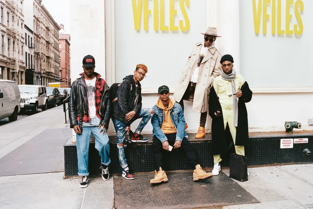
While some may view Portra as a professional film, Nick believes it’s one of the best introductions to colour film for new shooters. Its forgiving exposure range, soft tonal curve, and flexible ISO options make it incredibly beginner-friendly.
“If you slightly overexpose Portra, it rewards you with creamier highlights,” he explains. “And if you underexpose, especially with the 400 or 800 versions, you get deeper contrast without colour shifts.”
Nick often recommends Portra 400 for those learning film in Australia, as it works well in full sun, partial shade, and even late-day light. Paired with a reliable SLR like the Canon AE-1 or Nikon FM2, Portra gives predictable, beautiful results, even when mistakes happen.
From Lab to Print: Nick’s Portra Workflow
Nick Karagiannis believes that shooting Portra is only part of the process; the way it’s handled after exposure can make or break the final result. Whether sending it to a pro lab or scanning it himself, Nick follows a consistent process that protects Portra’s subtlety and emotion.
Preferred Sydney Labs
For most of his professional work, Nick uses:
- Rewind Photo Lab (Leichhardt) – praised for gentle colour correction and consistency.
- Kent Street Studio (CBD) – his go-to for medium format scanning.
“These labs understand Portra’s personality,” he says. “They won’t flatten it or oversaturate just to ‘pop’ an image.”
Scanning Tips
Nick favours Noritsu scanners for 35mm and Epson V850 for medium format. He avoids aggressive sharpening and instead softens transitions in Lightroom, mimicking the delicate tonal roll-off Portra is known for.
He also warns against over-editing. “Portra is already beautiful,” he explains. “You don’t need to force a look. Let the colours do the speaking.”
For beginners scanning at home, he suggests starting with Epson’s default settings, adjusting only for dust removal and minor exposure correction.
Pairing Portra with Vintage Gear
As a collector and active user of older film cameras, Nick has tested Portra extensively with gear from his Vintage Camera Collection. His top pairings include:
Canon AE-1 + Portra 400
A classic beginner-friendly setup. Nick uses this for shooting in bright daylight around Sydney Harbour.
Nikon F3 + Portra 800
For street shooting and indoor work in moody conditions. “That meter is reliable, and the viewfinder is perfect for fast scenes.”
Rolleiflex TLR + Portra 160
The square format and shallow depth of field give his portraits a dreamy softness, especially under overcast skies.
Each of these cameras brings a different voice to the film. But Nick insists, “Kodak Portra adapts. It takes on the personality of your camera and scene.”
Nick Karagiannis Nature Photography Tips: Using Portra Outside the City
While Portra performs exceptionally in Sydney, Nick’s nature shots across Australia also rely heavily on its tonal capabilities. He offers several tips for landscape photographers:
Shoot at Box Speed or Slightly Overexpose
Portra handles overexposure gracefully. Nick often shoots Portra 400 at ISO 200 to enhance brightness in shadow-heavy scenes, like forest undergrowth or coastal rock faces.
Filter for Harsh Light
A warming filter (81A) helps balance midday sun in the Australian outback, especially with Portra 160.
Embrace Cloudy Days
Portra loves soft light. “You’ll find more detail and atmosphere on a cloudy day than a clear one,” Nick notes.
These strategies have helped Nick capture fog in the Blue Mountains, eucalyptus canopies, and remote desert scenes, all in natural colour with quiet emotional depth.
The Emotional Side of Portra
For Nick Karagiannis, the appeal of Portra isn’t just technical, it’s emotional. The film’s ability to capture subtlety makes it ideal for storytelling. Where digital can feel clinical, Portra invites warmth.
“There’s a memory-like quality to Portra images,” he explains. “You don’t remember a moment in exact colour or perfect detail. You remember it in tone, in feeling, and that’s what Portra gives you.”
Many of his most personal projects, including family portraits, quiet moments of solitude in Sydney, and the stillness of remote Australian towns, were all shot on Portra.
Why Portra Endures in the Age of Digital
Even with digital cameras now emulating film stocks through presets and AI-powered simulations, Nick believes there’s no replacement for real Portra. The way it reacts to light, to time, to handling, it creates something tangible and human.
“Portra has flaws,” he admits. “But those flaws are full of life. And when you look at a print made from Portra, you feel more than you see.”
That’s why Portra remains a fixture in his bag. Whether shooting a commercial campaign or a personal walk through Marrickville at dusk, Nick keeps a roll loaded, just in case light and feeling align.
Printing Portra: Why Physical Output Still Matters
Although Nick regularly scans his negatives for digital sharing, he insists that film’s full emotional weight comes alive in print.
He often produces large-format prints of his Portra images using fine art archival paper, allowing the tones to stretch and breathe across the frame. From sunset cliffs to quiet portraits in Redfern, these prints carry a softness and emotional weight that no screen can replicate.
“You stand in front of a Portra print, and it’s like standing inside the memory,” Nick explains. “It invites quiet. It holds the moment open for you.”
For photographers new to printing, Nick suggests starting with 8x10s or 12x18s on lustre paper, working with a trusted lab that understands colour-managed workflows. A favourite of his is Atkins Lab in Adelaide, where the tonal subtlety of Portra is treated with precision and care.
Nick Karagiannis: Should You Try Kodak Portra?
Nick Karagiannis would say: absolutely.
Whether you’re just starting out or returning to film after years away, Portra gives you freedom. It’s forgiving, consistent, and emotionally rich. It works with vintage gear, with natural light, and with real-world imperfection.
If you’re looking to shoot your first roll, Nick recommends grabbing Portra 400, a reliable SLR, and heading somewhere calm, a walk around Glebe, a quiet moment in Centennial Park, or a foggy street in Redfern.
And when that roll comes back from the lab? Don’t just look at the results. Ask yourself how they feel.
If you’re curious about camera pairings, lab recommendations, or shooting tips for your area, contact Nick Karagiannis directly.
Portra might just become your gold standard, too.
What ISO version of Kodak Portra does Nick Karagiannis recommend most?
Nick uses all three: 160, 400, and 800. His most used is Portra 400, thanks to its balance of flexibility, fine grain, and reliable results across varied lighting. It’s his go-to for street photography, portraits, and travel across Sydney.
Can Kodak Portra be pushed or pulled easily?
Yes. Portra is known for its excellent exposure latitude. Nick often pulls Portra 400 to ISO 200 in bright light for softer tones, and pushes Portra 800 to 1600 in low light for moodier results. It holds detail well even under overexposure or minimal light.
Is Kodak Portra suitable for beginners?
Absolutely. Nick believes Portra 400 is one of the best colour films for new shooters. Its forgiving exposure range makes it ideal for learning. You can overexpose slightly and still get beautiful, smooth results.
What camera does Nick pair most often with Portra?
Nick regularly uses the Canon AE-1 with Portra 400 for day-to-day film photography in Sydney. For low light or moody scenes, he switches to the Nikon F3 and Portra 800. For medium format portraiture, he chooses his Rolleiflex and Portra 160.
How does Kodak Portra render skin tones?
Portra is famous for natural, soft skin tones. Nick uses it for all his portrait work when he wants a luminous, honest look without artificial warmth or flatness. He finds it especially useful in Australia’s strong daylight.
Where does Nick develop his Portra rolls in Sydney?
Nick recommends Rewind Photo Lab in Leichhardt for consistent, high-quality C41 processing and Kent Street Studio in the CBD for detailed medium format scans. Both labs handle Portra with the subtle touch it requires.
What scanner does Nick prefer for Portra negatives?
For 35mm, Nick uses Noritsu scanners, which retain the film’s colour depth and clarity. For medium format, he uses an Epson V850. He avoids over-processing, preferring soft tonal transitions and minimal digital interference.
How does Portra compare to other colour films?
Nick sees Portra as the most balanced option. Compared to Ektar, it’s less saturated and more subtle. Compared to Fuji Pro 400H, it handles skin tones more consistently. It’s his default when he wants realism and mood without exaggeration.
Is Kodak Portra good for landscapes?
Yes. Portra 160 and 400 both perform well in nature. Nick often uses 160 for coastal scenes and spring light in the Centennial Parklands. He praises how it renders green and blue tones without overwhelming the frame.
Does Nick print his Portra images?
Often. He creates large-format prints using archival paper to showcase Portra’s tonal softness and natural palette. His favourite Australian print lab for color accuracy is Atkins Lab in Adelaide.
What’s Nick’s tip for first-time Portra shooters?
Keep it simple. Use one roll, one camera, and shoot slowly. Overexpose by a stop if you’re unsure, and focus on light and emotion, not technical perfection. Then review the scans and learn from what you feel as much as what you see.
Why Kodak Portra Remains a Staple in Nick Karagiannis’ Film Bag
For Nick Karagiannis, Kodak Portra is more than just a dependable film stock. It’s a medium that mirrors his photographic philosophy, quiet observation, emotional honesty, and a respect for natural light. Whether capturing fleeting expressions on Sydney’s streets or the shifting tones of Australia’s open landscapes, Portra helps him translate feeling into frame.
Its subtlety is its strength. Where some films shout, Portra whispers. It invites patience, rewards careful metering, and adapts beautifully across light conditions, formats, and moods. This versatility has made it Nick’s most trusted companion in both professional and personal work.
For any photographer looking to reconnect with the tactile, intentional side of image-making, Portra offers that bridge. It doesn’t get in the way. It lets the story unfold in colour that feels honest and human.
Nick continues to recommend Kodak Portra not just for its quality, but for what it teaches. Shoot slowly. Trust your eye. Let light guide you. And when you review your negatives, focus less on perfection and more on presence. That’s the real power of Portra.